Filters & Frequencies
Part of CS180 : Intro to Computer Vision and Computational Photography
In this project, we will learn to use filters, convolutions, frequencies, and Fourier transforms to manipulate images. We will explore edge detection, sharpening, blurring, hybrid images, and multiresolution blending.
Filters
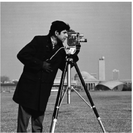
Filters are vital in image processing to manipulate images in various ways. To apply a filter to an image, we need to convolve the filter with the image. For this section, we will use the black-and-white image of a cameraman and only use a single channel for simplicity.
Finite Difference Operator
\[d_x = \begin{bmatrix} 1 & -1 \end{bmatrix} , \, d_y = \begin{bmatrix} 1 \\ -1 \end{bmatrix}\]This is the Finite Difference Operator, when applied to a 2D image, it will give us the magnitude of change on a pixel level in the x and y directions. This can be treated as a partial derivative and is a simple way to detect edges in an image. Let us convert our FDOs into convolution kernels.
\[d_x = \begin{bmatrix} 0 & 0 & 0 \\ 0 & 1 & -1 \\ 0 & 0 & 0 \end{bmatrix} , \, d_y = \begin{bmatrix} 0 & 0 & 0 \\ 0 & 1 & 0 \\ 0 & -1 & 0 \end{bmatrix}\]Now, we can apply these kernels using convolution to an image to detect edges in the x and y directions. While a rudimentary way to combine these two is to use the logical OR operator, a better way is to use the magnitude of the gradient. This can be calculated using the following formula:
\[\text{img_x} = \text{img} \ast d_x \\ \text{img_y} = \text{img} \ast d_y \\ \text{magnitude} = \sqrt{img_x^2 + img_y^2}\]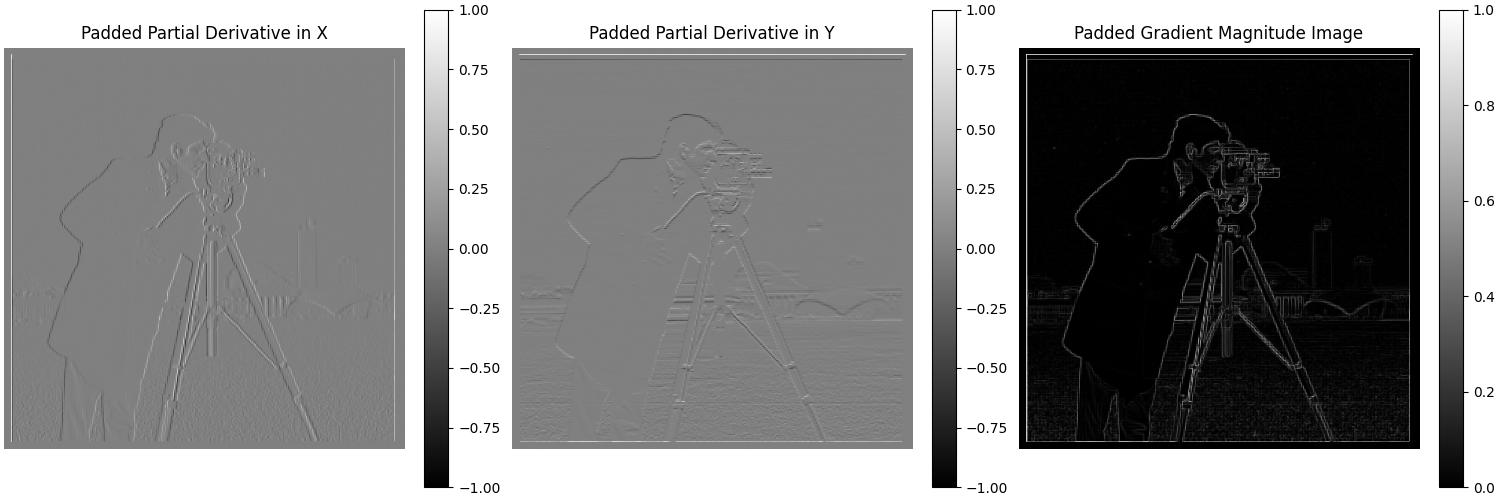
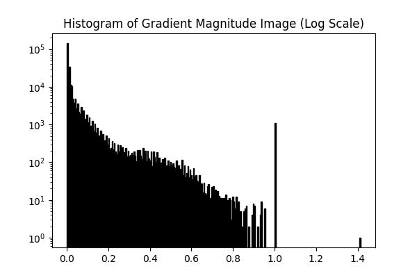
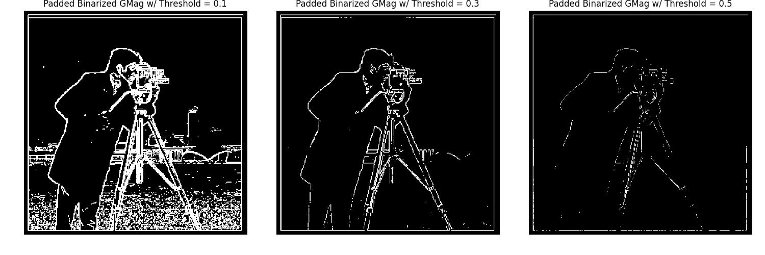
The gradient magnitude image better highlights the edges in the cameraman image. The log-scale histogram of the gradient magnitude image shows that most of the pixels have a low gradient magnitude, however, there still is quite a bit of noise, and the peak near 0.9 is due to the borders of the image. Therefore, we can binarize the gradient magnitude image with a threshold of 0.3 to get a cleaner edge detection.
Gaussian Filters
In this part, we will be using a Gaussian filter to smooth the image before applying the Finite Difference Operator. This will help reduce the noise in the image and give us a cleaner edge detection. We will also be creating a Derivative of Gaussian filter to combine the Gaussian filter and the FDO into a single convolution.
Let us first create a 2D Gaussian filter and convolve it with the cameraman image. We will then apply the FDO to the blurred image and calculate the gradient magnitude.

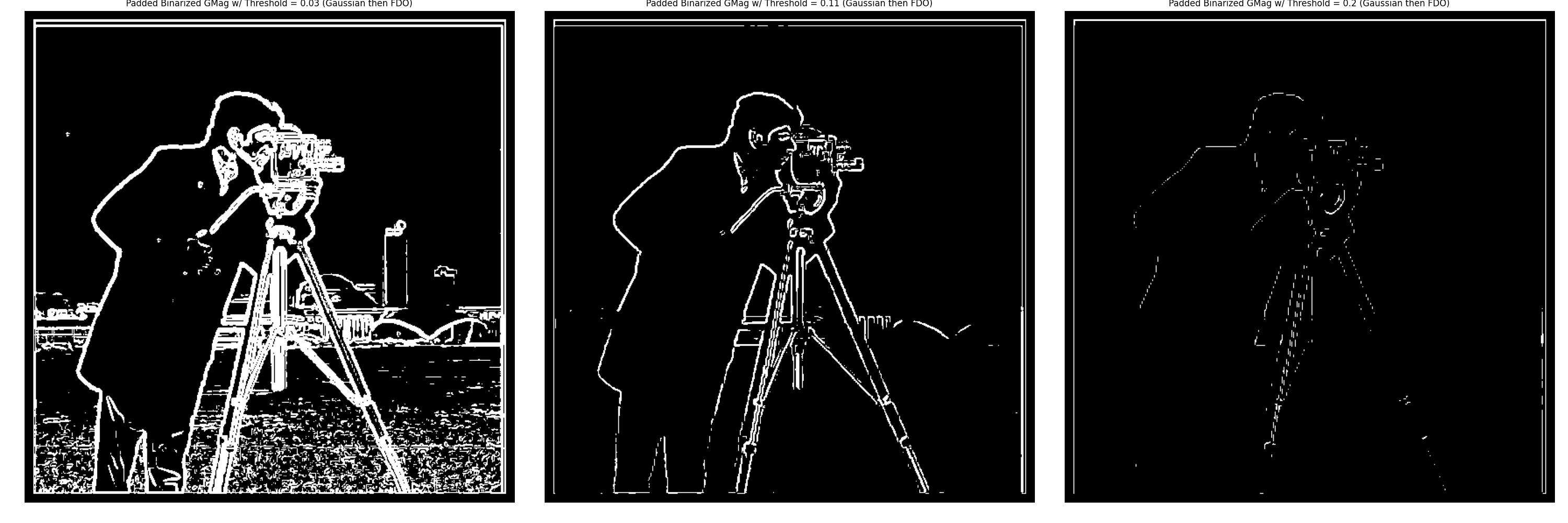
The gradient magnitude image after applying the Gaussian filter shows a cleaner edge detection compared to the previous results. The edges appear rounder and less abrupt in our FDO pass, resulting in a thicker and smoother outline of the cameraman in the magnitude image. The binarized gradient magnitude image with a threshold of 0.11 was selected as it provides a good balance between edge detection and noise reduction.
Derivative of Gaussian (DoG) Filter
Now, we will create a Derivative of Gaussian filter by convolving the Gaussian filter with the FDO. This will allow us to combine the Gaussian filter and the FDO into a single convolution. We will then apply the DoG filter to the cameraman image and calculate the gradient magnitude.
In calculating the DoG filter, it is important to have a Gaussian filter with a large enough kernel size, otherwise, the DoG filter will be overly dominated by the FDO.

Now, we will apply the DoG filters to the cameraman image and calculate the gradient magnitude.


The gradient magnitude image after applying the DoG filter matches the results from the Gaussian filter and then FDO. Just as before, the edges are smoother and the noise is reduced, resulting in a cleaner edge detection. The binarized gradient magnitude image with a threshold of 0.11 was selected as it provides a good balance between edge detection and noise reduction, and all 3 threshold values match the results from the Gaussian filter then FDO.
Frequencies
Let us now explore the concept of frequencies in images. Just like sound waves, images can be broken down into different frequencies. Low-frequency components in an image represent the smooth areas, while high-frequency components represent the edges and details. We can use Fourier transforms to analyze the frequency components of an image.
Sharpening
Let us now explore the concept of sharpening an image. Sharpening an image involves enhancing the edges and details in the image. Our intuition tells us that to sharpen an image, we need to enhance the high-frequency components of the image. But how do we get these high-frequency components?
The Gaussian filter we used earlier is a low-pass filter, meaning it removes high-frequency components from the image. To get the high-frequency components, we can subtract the blurred image from the original image.
Let us examine the difference between the original image and the blurred image.
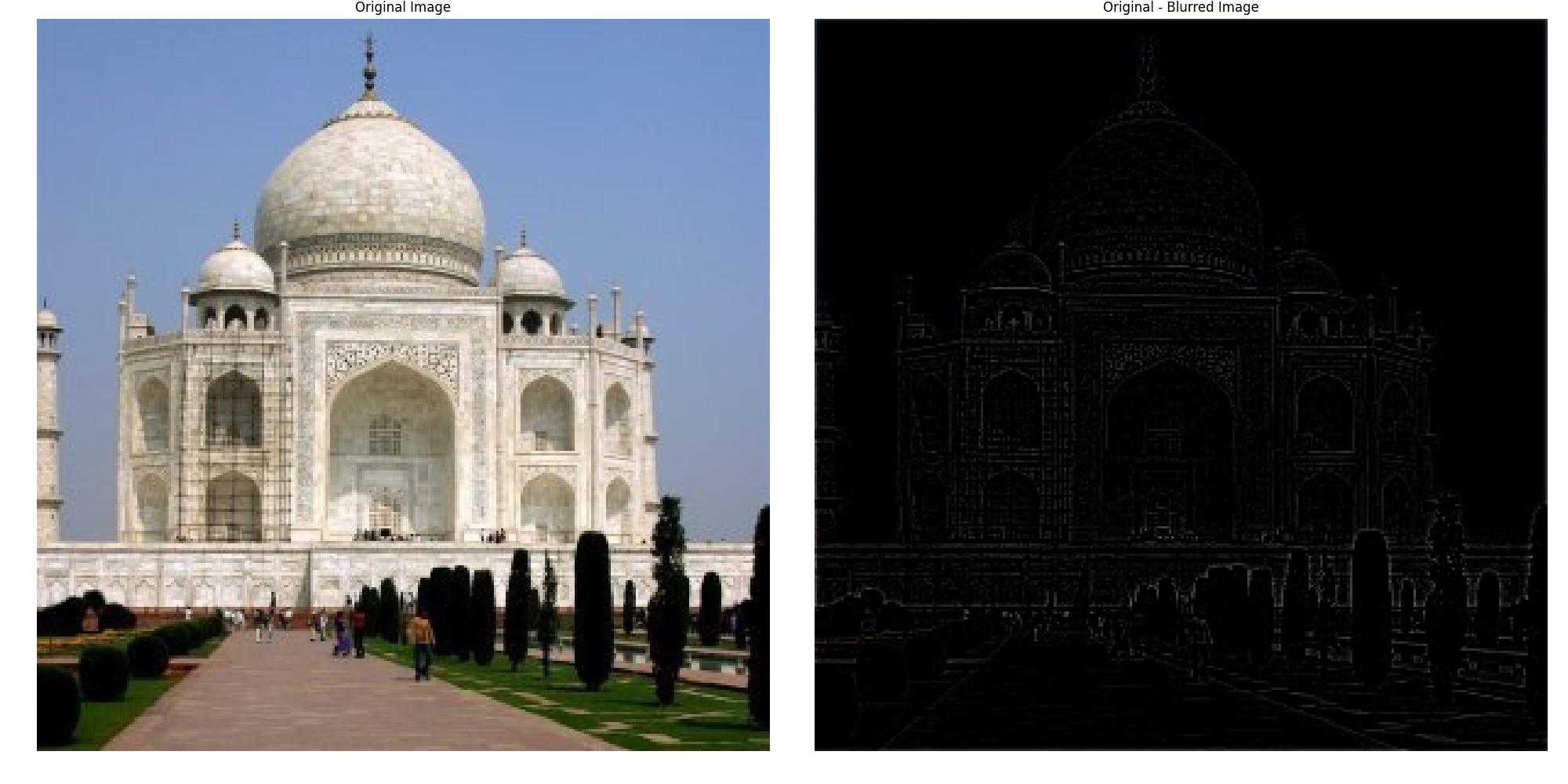
In order to ‘sharpen’ our image, we will need to accentuate the high-frequency components in our image. This can be done by adding the high-frequency image back to the original image with a scaling factor to control the intensity of the sharpening. This is known as the unsharp mask.
\[\text{Unsharp_Mask} = \text{Single Impulse Response} + (\text{Single Impulse Response} - \text{Gaussian Filter}) \times \alpha\] \[\text{Unsharp_Mask} = \begin{bmatrix} 0 & 0 & 0 \\ 0 & 1 & 0 \\ 0 & 0 & 0 \end{bmatrix} + \left( \begin{bmatrix} 0 & 0 & 0 \\ 0 & 1 & 0 \\ 0 & 0 & 0 \end{bmatrix} - \text{Gaussian_Kernel} \right) \times \alpha\]When the unsharp mask is convolved with the image, it will scale the high-frequency components of the image, enhancing the edges and details.

The sharpened image shows enhanced edges and details, notice the increased contrast in the left scaffolding as well as the brick patterns on the dome and road. Features that are low frequency, such as the sky and the grass, remain unchanged.
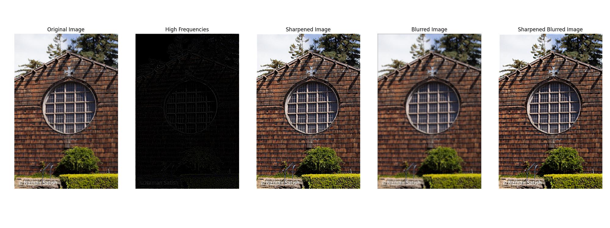
Here, we have a landscape image that has been blurred and then sharpened. The original sharpened image shows greater contrast and detail in the wood shingles, and the text in the bottom left is more legible. The sharpened image also has the circular window in the center more defined. The blurred and then sharpened image shows a similar level of contrast in the wood shingles but without detail. The text in the bottom left has regained its legibility, and the circular window shares the same level of contrast as the sharpened image, but without the detail.
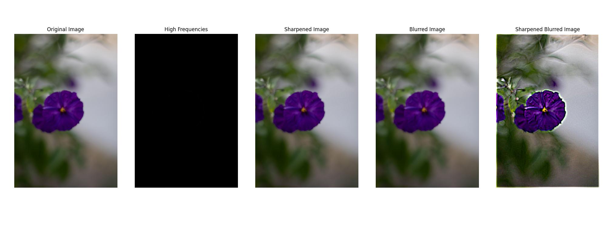
In this example, I chose a picture I took of a purple flower that was out of focus. The original sharpened image shows no perceptible difference, as the high-frequency components are negligible, and ergo, the sharpening effect is minimal. The blurred image likewise lacks any noticeable difference from the original image, as there were very few high-frequency components to begin with. For the final blurred to sharpened image, I greatly increased the alpha value to 10, sigma to 4, and kernel size to 15. This demonstrates some of the limitations of sharpening, as the image has received an effect akin to chromatic aberration. There is color fringing around the edges of the petals, out-of-focus details such as the leaves seem less natural, and the overall image noise has increased. The sharpened image has gained detail in the center of the flower but at the cost of the image’s overall aesthetic quality.
Hybrid Images
In this section, we explore the creation of hybrid images, a technique introduced in the SIGGRAPH 2006 paper by Oliva, Torralba, and Schyns. Hybrid images are fascinating images that change their perceived content depending on the viewing distance. This effect is achieved by blending the high-frequency details of one image with the low-frequency information of another. At close distances, the high-frequency content dominates perception, while at farther distances, the low-frequency content becomes more prominent, leading to different interpretations.
The process involves applying different filters to the images: a low-pass filter to capture the smooth, low-frequency information from one image, and a high-pass filter to isolate the fine details or high frequencies of another. When combined, these images form a hybrid that presents multiple layers of perception depending on how it is viewed. This section details the steps for creating hybrid images and explores the impact of various choices, such as filter design and the use of color in different frequency components.
Aligning Images
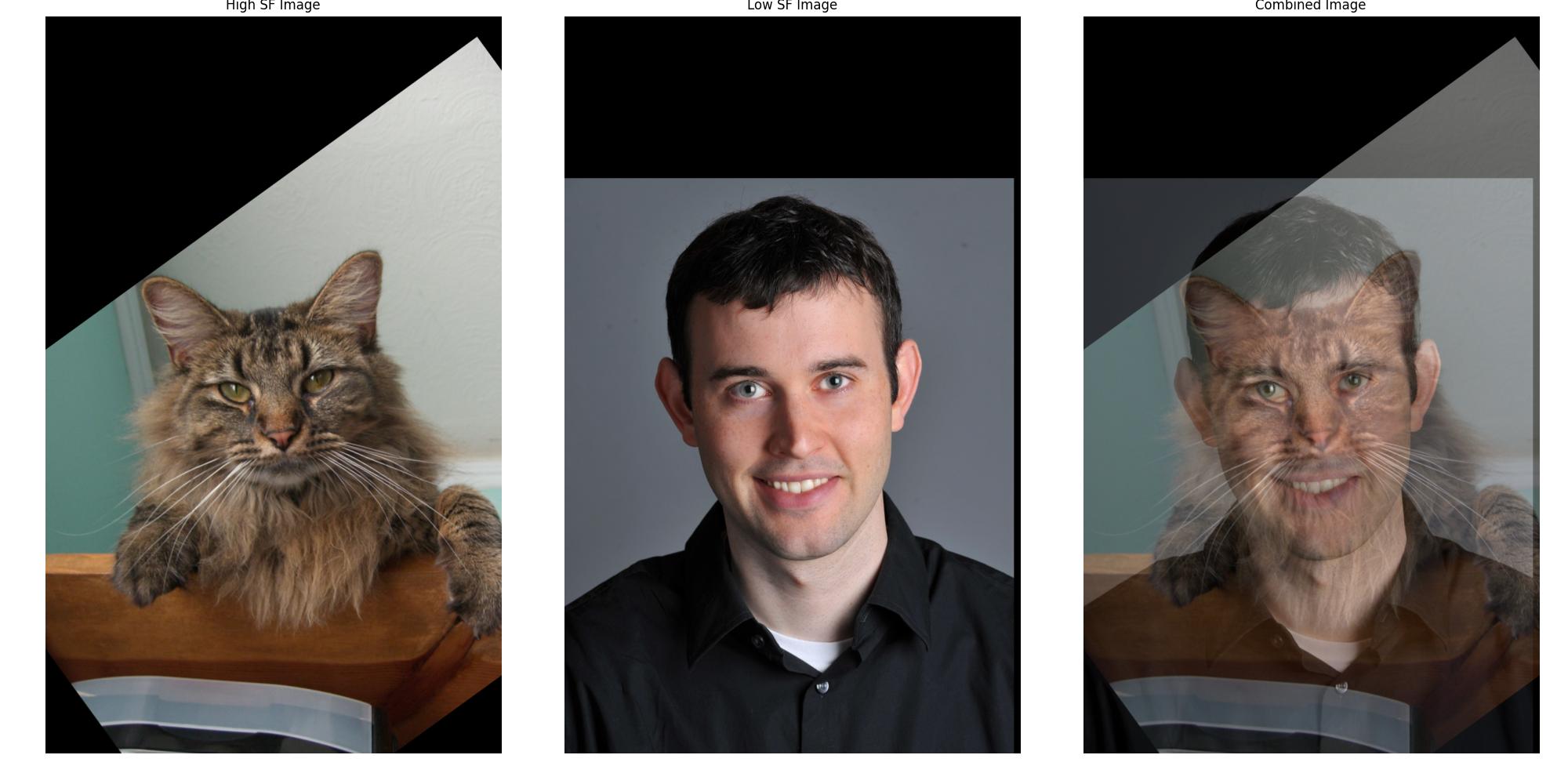
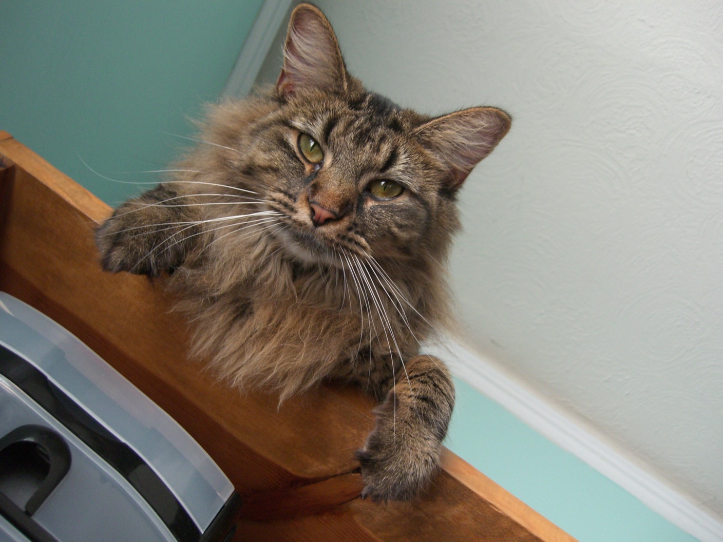
Before creating a hybrid image, it is crucial to ensure that both input images are properly aligned. Misalignment can lead to unintended visual artifacts and can distort the hybrid effect, making the high-frequency and low-frequency blending less effective. For my examples, I will rely on 2 images: a high-frequency image of Nutmeg the cat and a low-frequency image of Derek.
To align the images, I used a custom function align_images() that allows for interactive adjustment of the images. This step ensures that key features of the two images (e.g., the eyes or other facial features) are correctly aligned. Proper alignment affects the perceptual grouping, allowing the hybrid effect to function as intended. In my final results, I used sci-kit’s affine transformations to align the images to better match features between the two images.
Here is an example of how the images look after alignment:
Fine-Tuning the Gaussian Cutoff
In the process of creating hybrid images, an essential step involves applying both low-pass and high-pass filters. The degree to which these filters affect the image is controlled by a parameter, \(k\), which governs the response of the Gaussian filter at the cutoff frequency.
I derived a specific value of \(k\) known as k_half_response, which corresponds to when the Gaussian filter retains 50% of its amplitude at the cutoff frequency. This value ensures a smooth transition between frequencies and helps balance the high and low-frequency components in the hybrid image.
The key equations used are:
\[f_c = \sqrt{2 \ln(c)} * {\sigma_f}, \, \text{for a response of } \frac{1}{c} \text{ at} f_c\] \[\sigma_t * \sigma_f = \frac{N}{2 \pi}, \, \text{where } N \text{ is the image dimension}\]Where \(f_c\) is the cutoff frequency, \(\sigma_t\) is the standard deviation of the Gaussian filter in the spatial domain, and \(\sigma_f\) is the standard deviation of the Gaussian filter in the frequency domain. To adjust the cutoff frequency to correspond to a specific half-amplitude response, we substitute and solve for \(\sigma_t\) in terms of the image size and the desired cycles per image. This led to the derivation of k_half_response as:
\[\sigma_t = \frac{\sqrt{2\ln(c)}\times N}{2\pi \times f_c}\] \[\sigma_t = \frac{\sqrt{2\ln(c)}}{2\pi} \times \frac{N}{f_c}\] \[\sigma_t = k \times \frac{N}{\sqrt{2}}\] \[k = \frac{\sqrt{2\ln(c)}}{2\pi}\]This value of \(k\) provides an optimal balance where the Gaussian filter retains 50% of its amplitude at the cutoff frequency, ensuring a smooth transition between frequencies.
Adjusting \(k\) has a profound effect on the visual appearance of hybrid images. A lower \(k\) value results in a sharper cutoff, while a higher \(k\) value leads to a smoother blend between the high and low-frequency components. According to the research paper, it is important to have a good separation between the high and low-frequency components to achieve a proper transition in the hybrid image, and they chose a response of 1/2 at the cutoff frequency.
By experimenting with different values of \(k\), as shown in the series of hybrid images generated with varying \(k\) values, I could observe the delicate balance between how much detail is retained in the high-pass image versus how much smoothing occurs in the low-pass image.
Below is an example of how adjusting \(k\) affects the low-pass and high-pass images, as well as the combined hybrid image:
Hybrid Images with Different k Values

Through this experimentation, I felt that using the \(k\) value that corresponds to a 50% response at the cutoff frequency provided the best balance between the high and low-frequency components. This value allowed for a smooth transition between the two images, ensuring that the hybrid effect was visually striking and perceptually engaging.
Using the optimal \(k\) value, I was able to create a series of hybrid images that tested different frequency cutoffs.
Hybrid Range Comparison


The series of hybrid images above demonstrates the impact of varying the low-pass and high-pass filter cutoffs on the final image. As the low-pass cutoff decreases, the high-frequency details become more prominent when closer up, leading to a clearer representation of Nutmeg. Conversely, as the high-pass cutoff increases, the low-frequency information from Derek becomes more dominant when viewed from a distance. This allows for us to fine-tune the hybrid image to create different perceptual experiences based on viewing distance.
Importance of Color
In our hybrid image project, we explored the role of color in enhancing the perception of the final image, particularly focusing on whether color is best used in the low-frequency or high-frequency component. The results consistently show that applying color to the low-frequency image has a more significant impact than adding it to the high-frequency image. This outcome is closely tied to how the human visual system processes color and detail.
The human eye contains two types of photoreceptor cells: cones and rods. Cones are responsible for detecting color and operate best in well-lit conditions, while rods are more sensitive to light and handle vision in dim environments, primarily detecting brightness and detail without color. Importantly, cones are less responsive to high spatial frequencies (fine details) and more attuned to low spatial frequencies (broad shapes and forms).
When color is added to the low-frequency component, the cones can more effectively capture and process this information, leading to a more vivid and coherent perception of the image when viewed from a distance. This aligns with how we perceive objects in everyday life, where color tends to define far regions or shapes rather than intricate details.
In contrast, adding color to the high-frequency component (which contains the fine details) does not contribute as much to the overall perception. This is because the high-frequency details are processed primarily by rods, which are not sensitive to color. As a result, color information in these fine details often goes unnoticed, making it less important to emphasize color in the high-frequency regions.


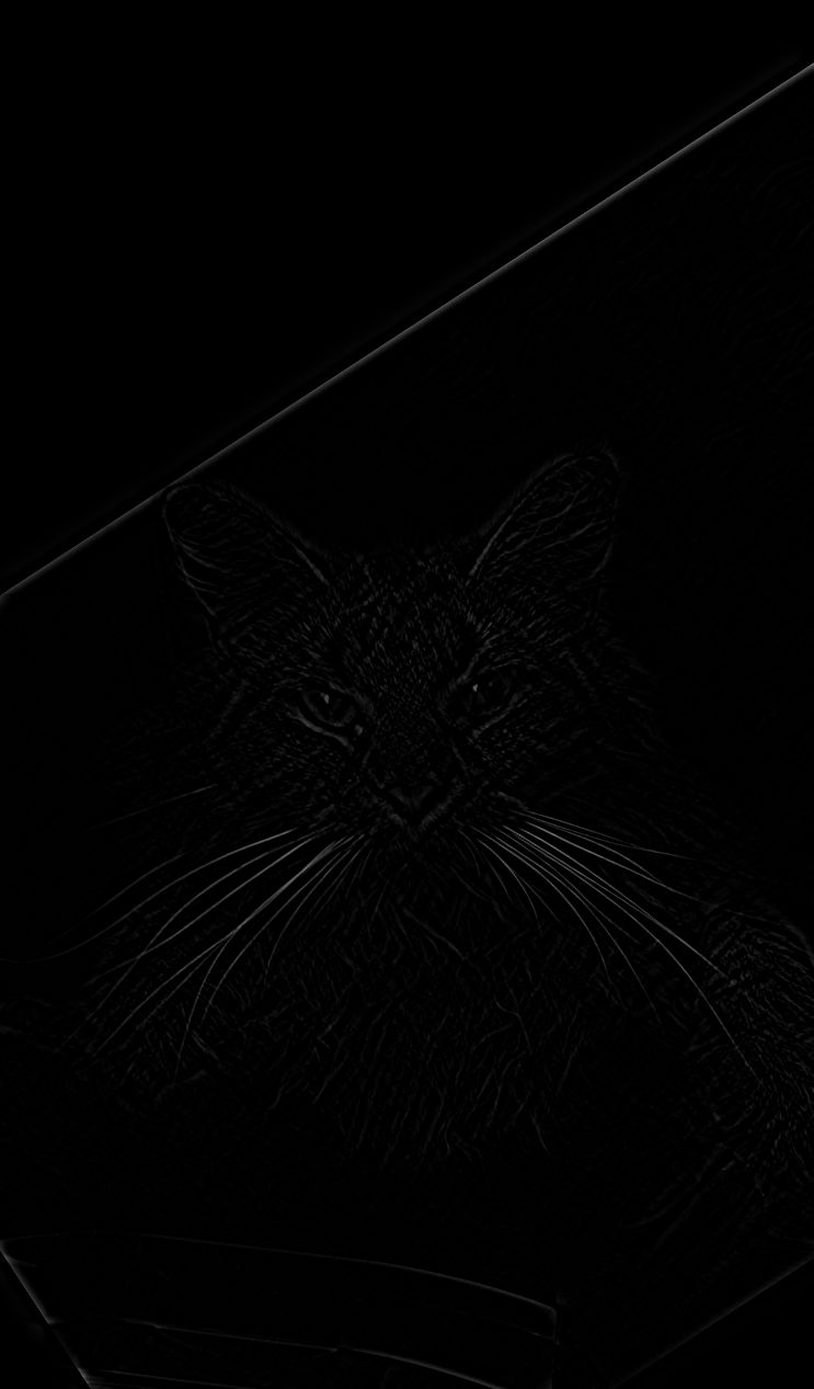

Hybrid Results
Derek and Nutmeg 6/16 : Success



Additional


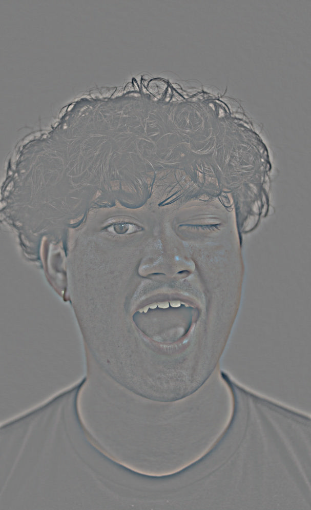
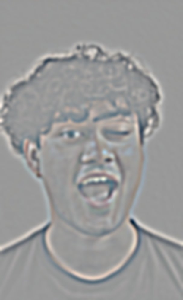
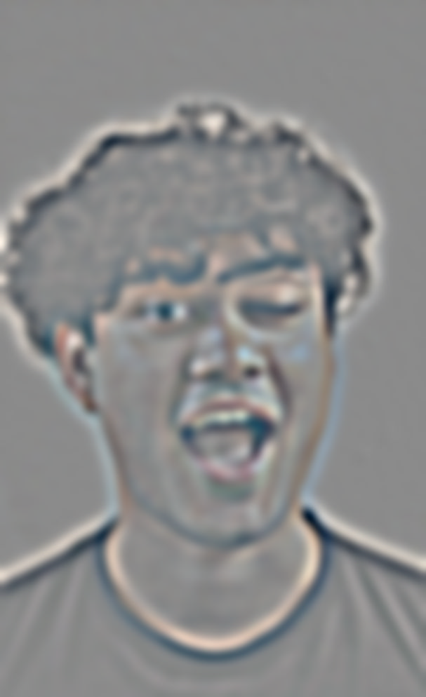
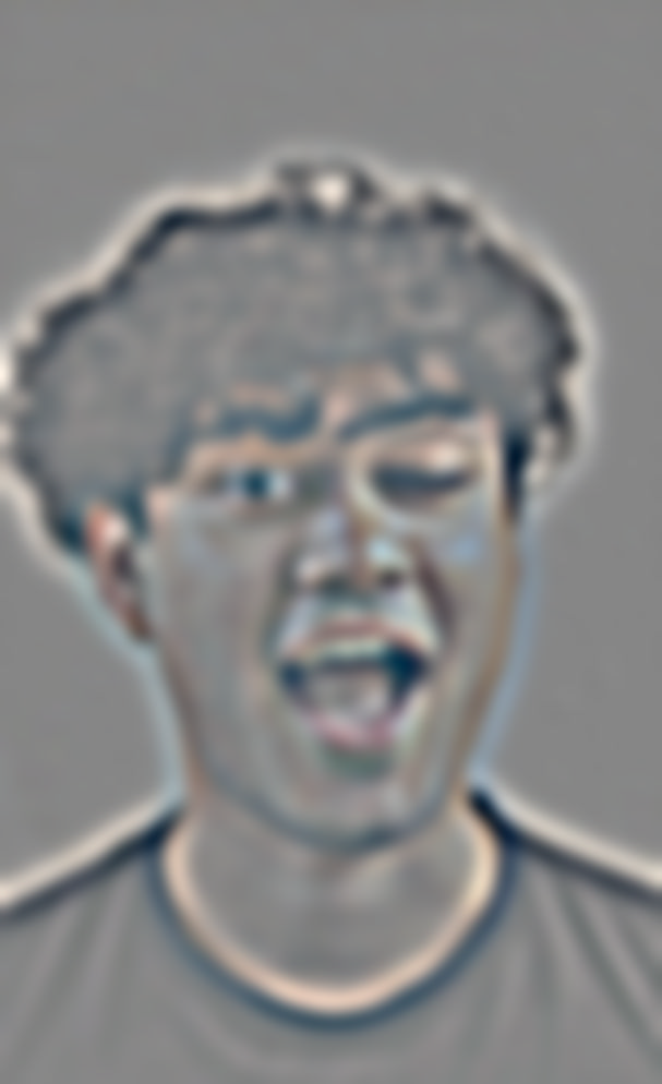
Derek and Wink 8/16 : Success


Additional


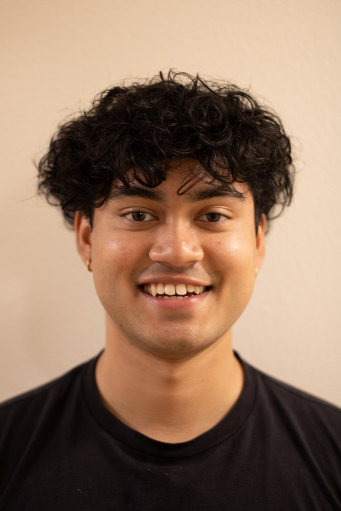
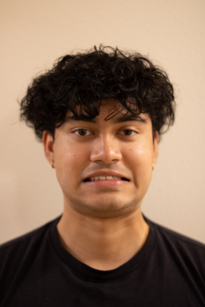
Smile and Disgust 8/6 : Failure


Additional


Smile and Disgust 8/8 : Failure


Additional


Smile and Disgust 8/10 : Success
Well spaced distance between the low and high frequency components, leading to a clear perception of both images at different viewing distances.


Additional


Smile and Disgust 8/12 : Success
Well spaced distance between the low and high frequency components, leading to a clear perception of both images at different viewing distances.


Additional


Smile and Disgust 8/16 : Failure


Additional


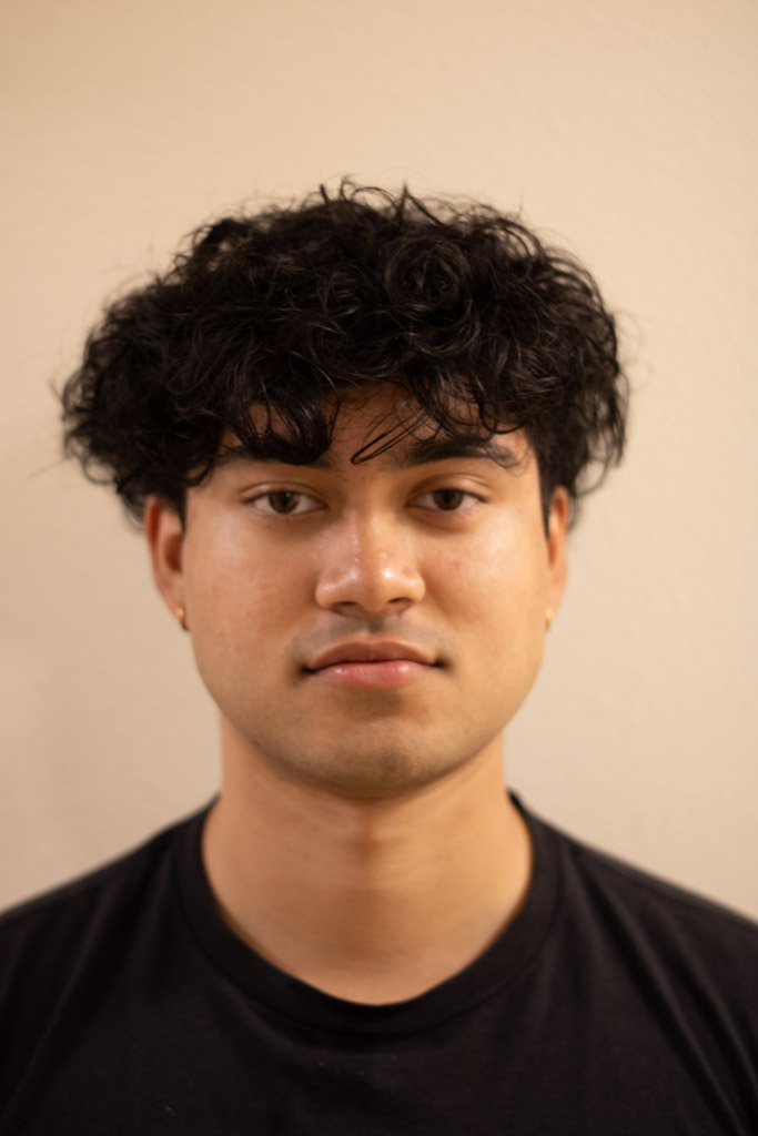
Smile and Rest 8/18 : Success



Additional


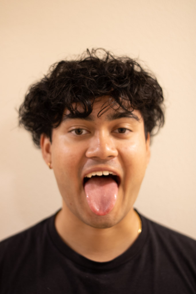
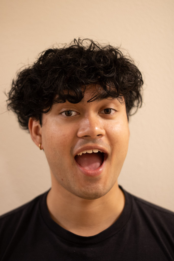
Tongue and Joy 8/16 : Success


Additional


White and Purple 6/12 : Failure
There is not enough feature overlap between the two images to create a successful hybrid image.


Additional


White and PurpleOoF 6/12 : Failure
Because the purple flower is out of focus, the amount of high frequency information is reduced. This results in a hybrid image that is not as clear as the previous ones.


Additional


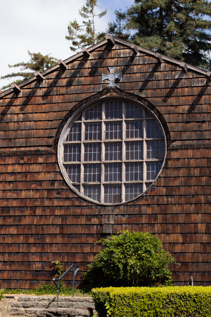
Woodcircle and Doetop 10/16 : Failure
While both images shared the half-circular feature and a very closely aligned roof, the alignment left Doe missing much of the picture. Hence, up close the hybrid image is still dominated by Bancroft Dance Studio.


Additional


Woodcircle and Pepsi 10/25 : Failure
While there is good edge sharing between the two images, the low-frequency image is too dominant in colors for you to see a pepsi logo. While the outline is clear, the illusion is not as strong as the other images.


Additional


Gaussian and Laplacian Stacks
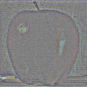
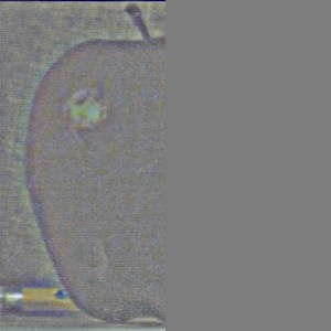
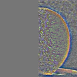
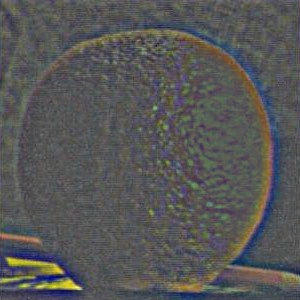
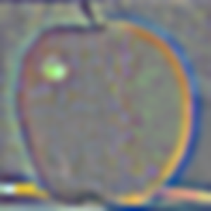
Previously, I implemented Gaussian Pyramids, but this time we will be using Gaussian and Laplacian Stacks. The difference between a Stack and a Pyramid is that a Stack does not downsample the image at each level. Instead, it keeps the image at the same resolution and only applies the Gaussian or Laplacian filter to it.
Orange and Apple No Mask : Success
Image Stack


Multiresolution Blending
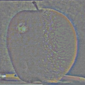
Now that we have the Gaussian and Laplacian image stacks, we can blend the two images using masks.
Orange and Apple Mask : Success
The classical combination of an apple and an orange, the oraple. The mask is a simple gradient from left to right.
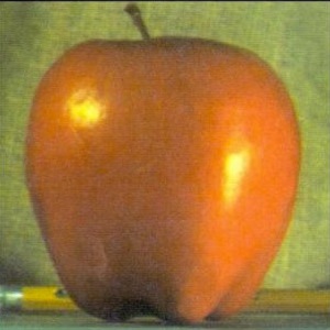
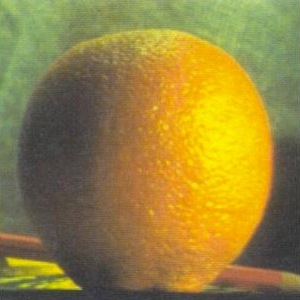
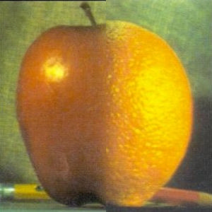
Image Stack











Car Left and Car Right : Success
Oh no, the cars are about to collide! Just kidding, this is two images blended!


Image Stack


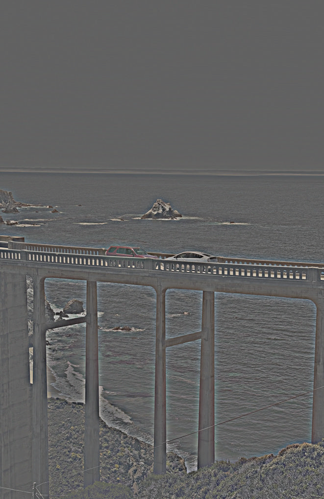


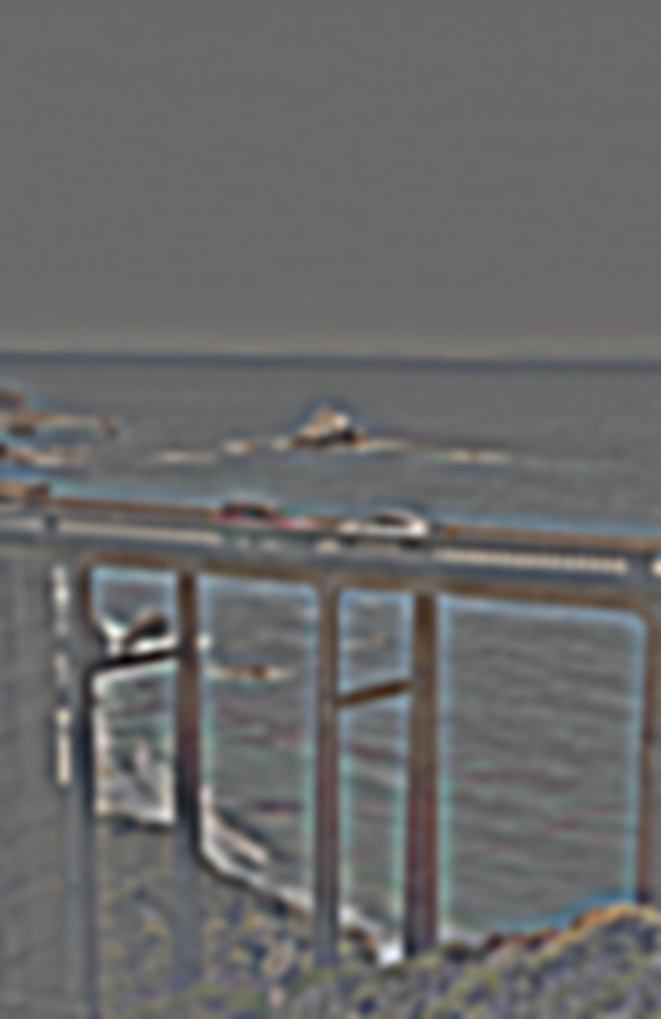


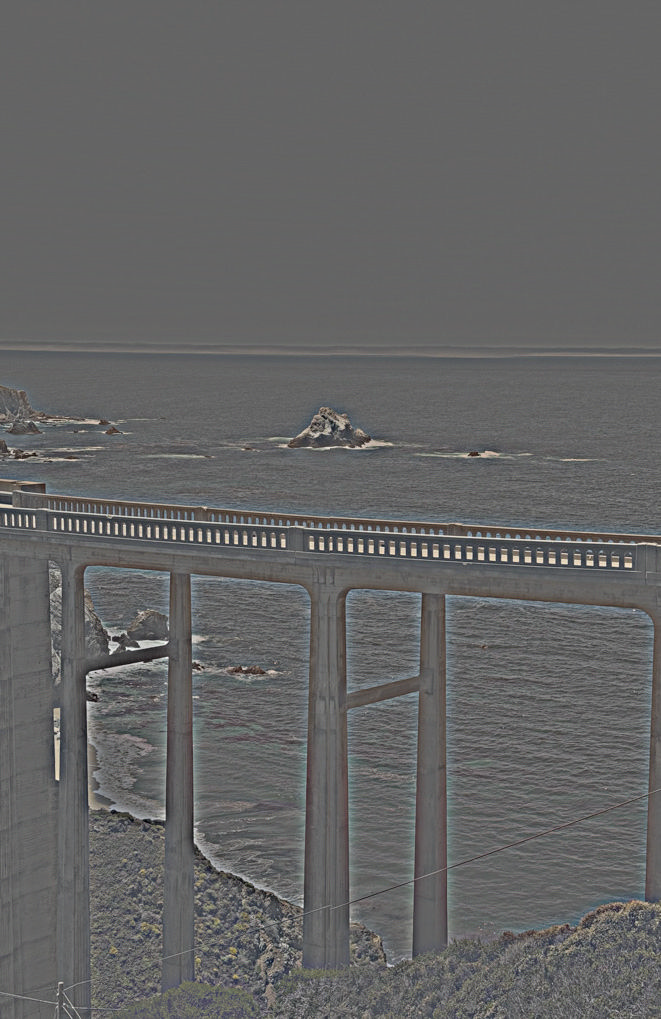
Car Right and Car Left : Success
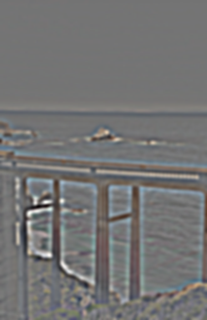
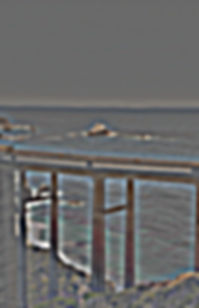
When I originally took these two images, I was quite sad because if I had taken a third image, I could have used a median metric to blend the two images without the cars. However, thanks to the power of multi-resolution blending, I was able to split the images between the cars and the background and blend them. The slightly different perspective results in some issues with the column in the center, however, I am still pleased with the result since by coincidence both images have the cars in barely the right spot to blend them.


Image Stack








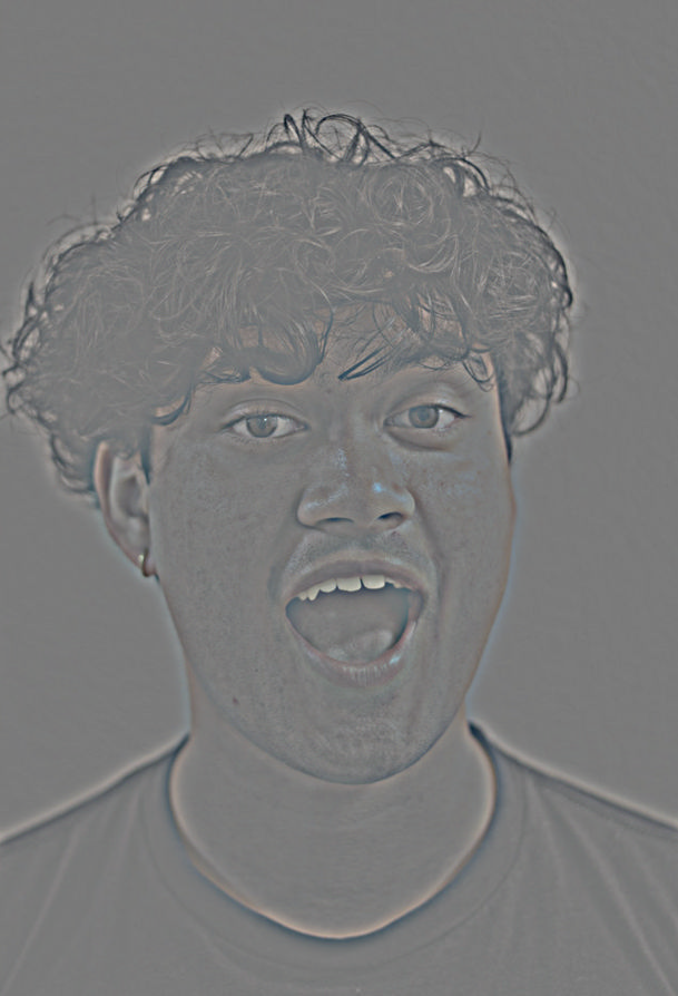
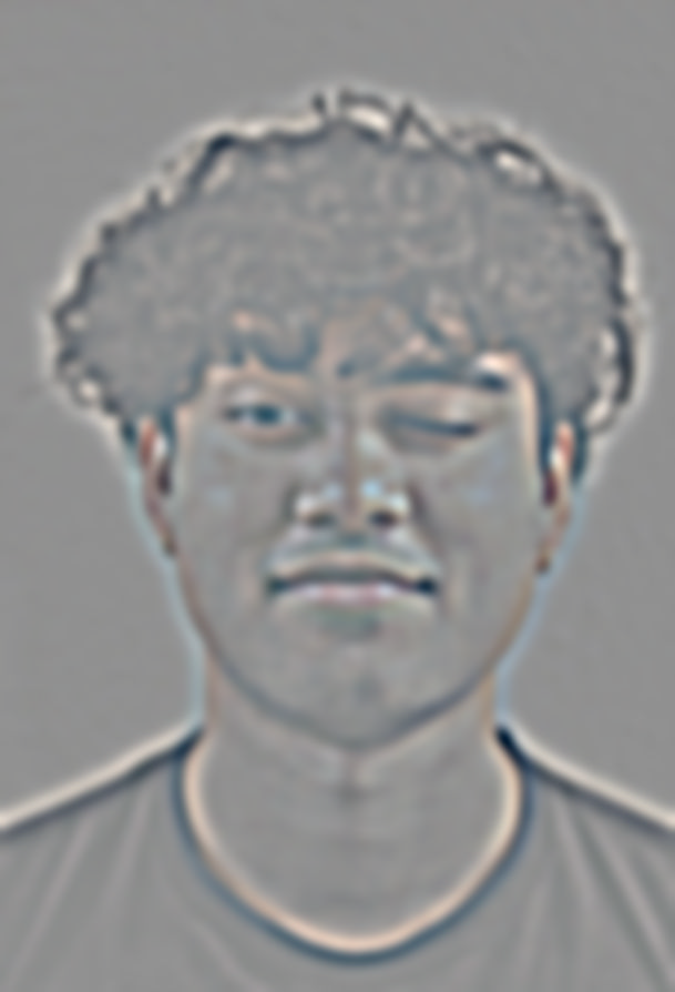
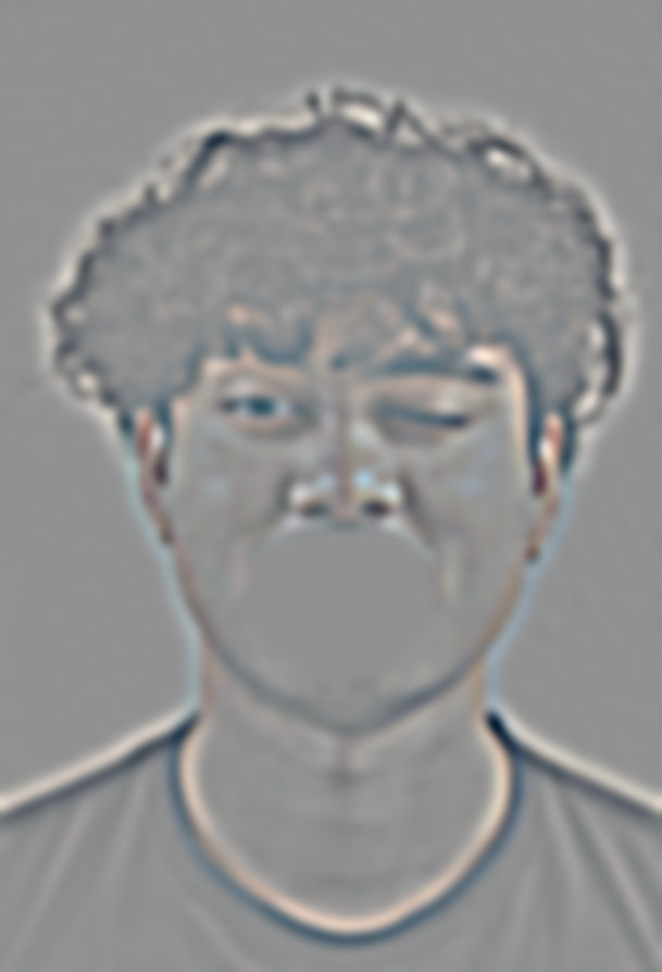
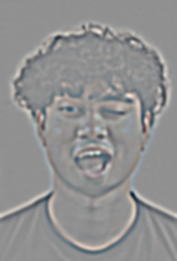
Wink and Joy : Failure
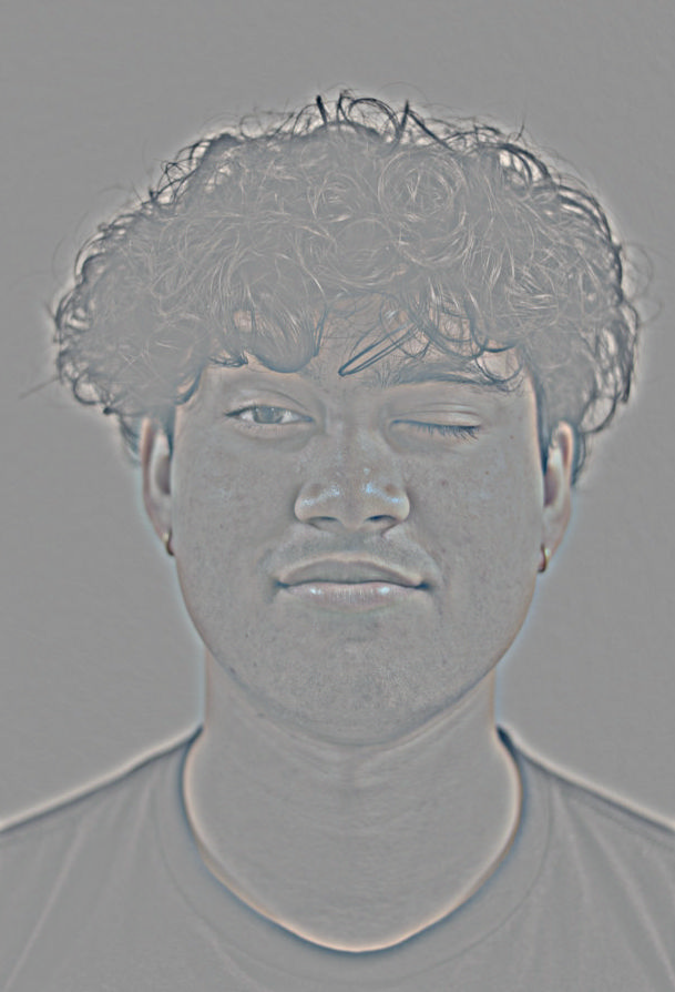
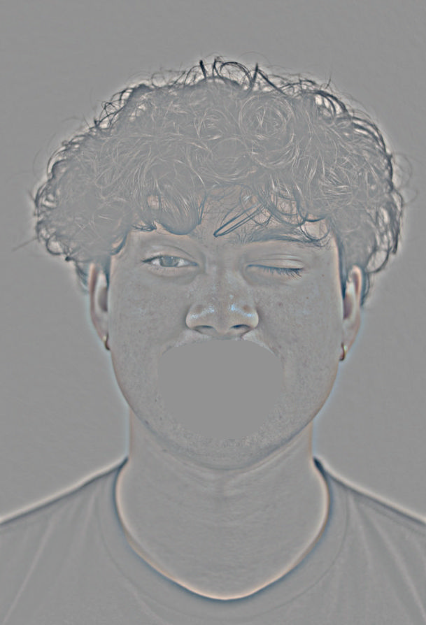
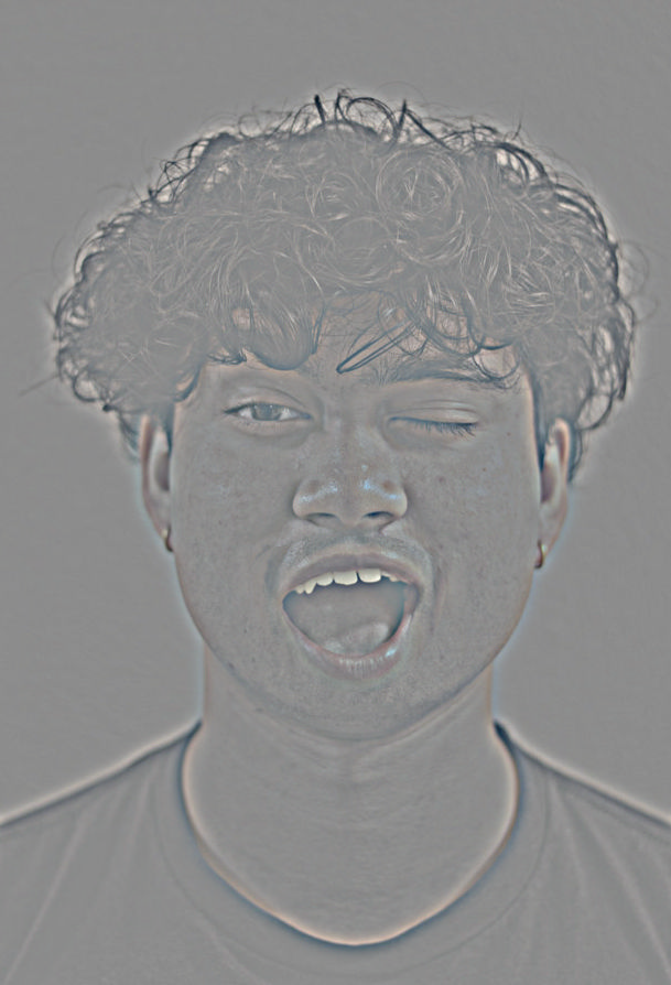
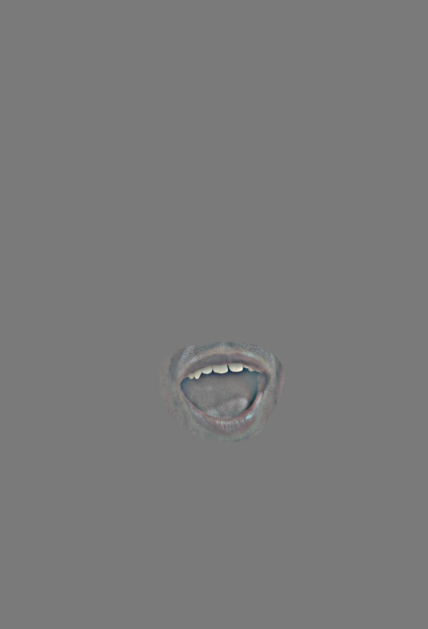
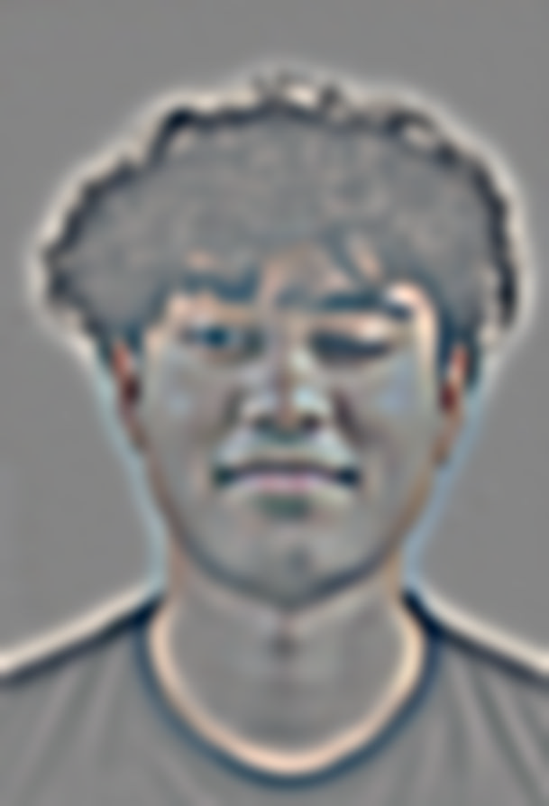
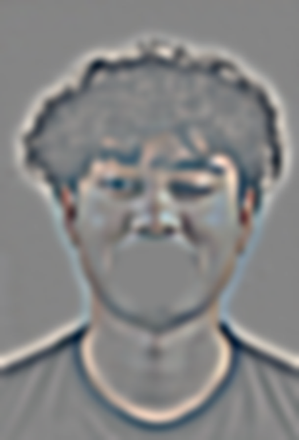
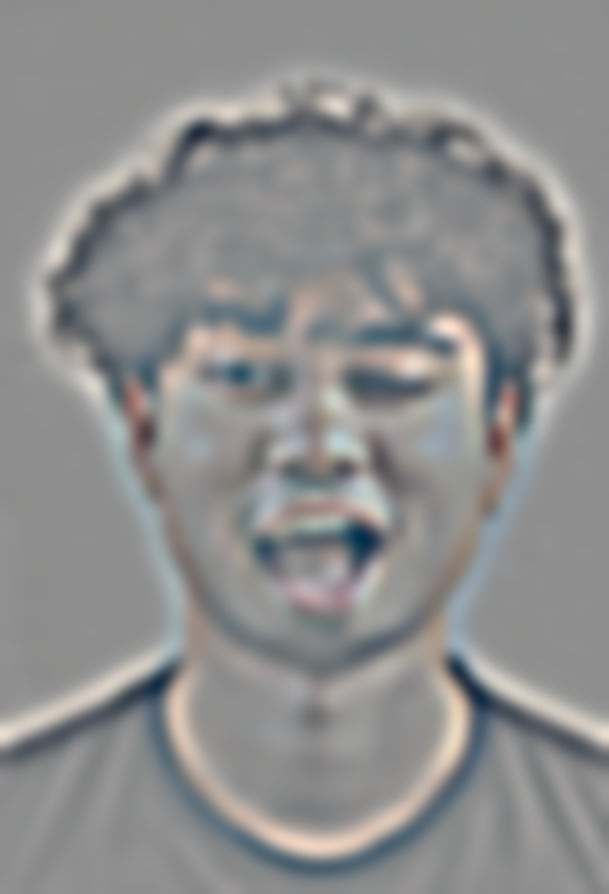
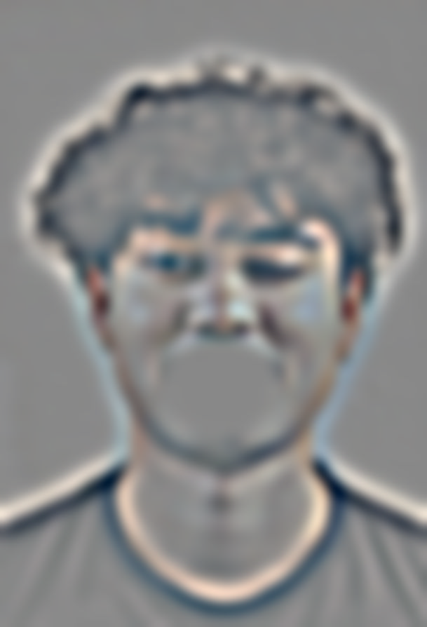
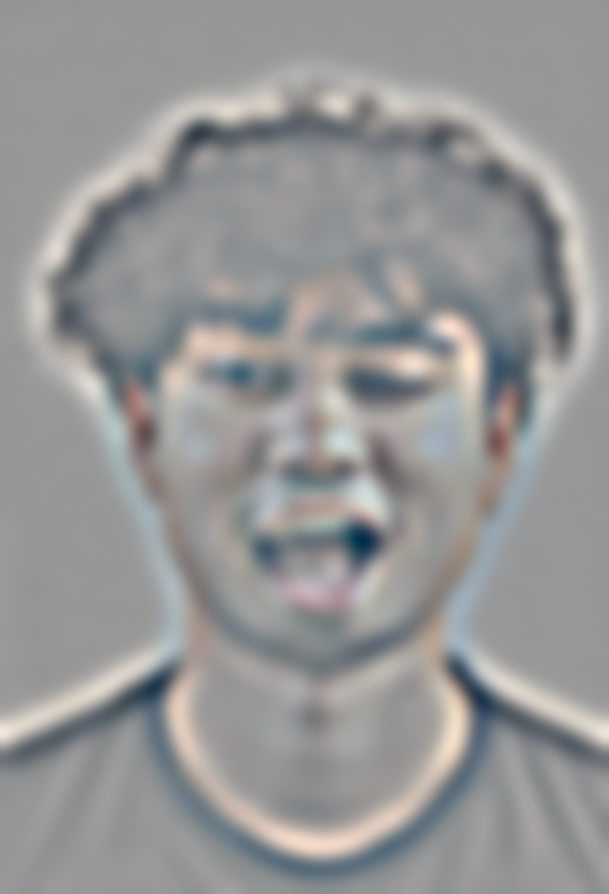
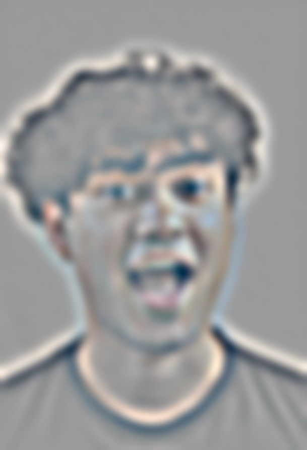
Here, we can move facial expressions across images. The facial expressions are blended seamlessly, however, because we expect the jaw to move along with the mouth, the jawline in our blended image causes us to question the image. This is both a limitation of the mask and the source data available. The poor blend could additionally be amplified by the Uncanny Valley effect, a phenomenon where our perception of near human-like objects is more negative than objects that are clearly not human-like. This is why the blended image looks a bit off, the expectations from what a human face should look like are not met.

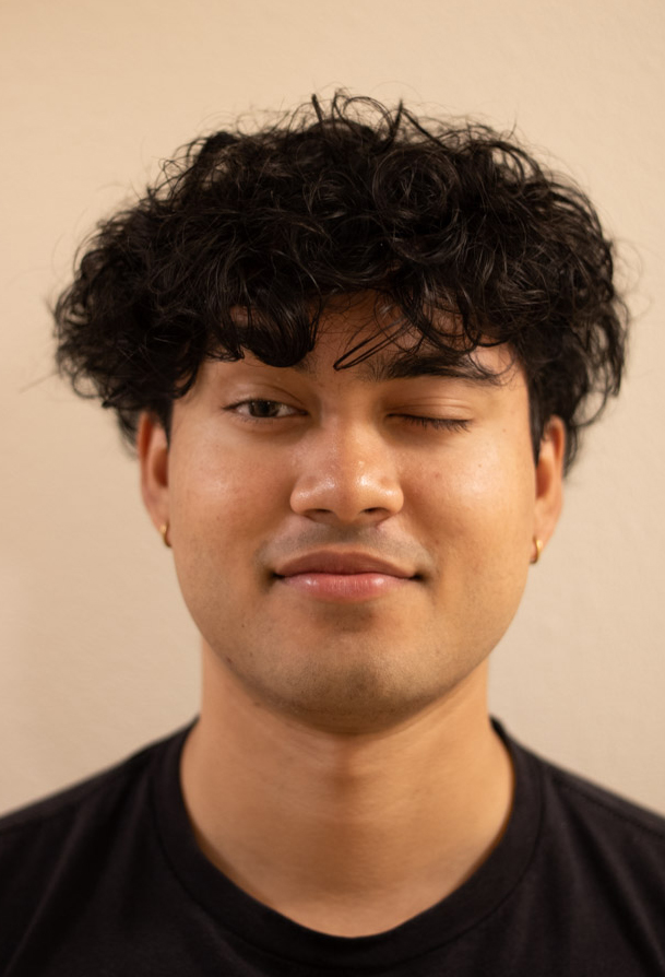

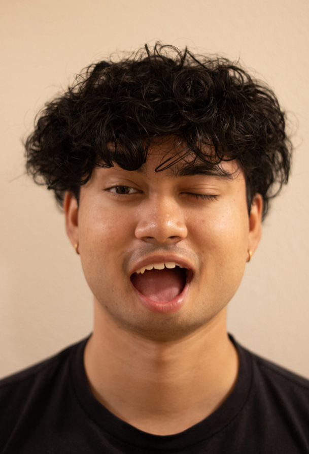
Image Stack

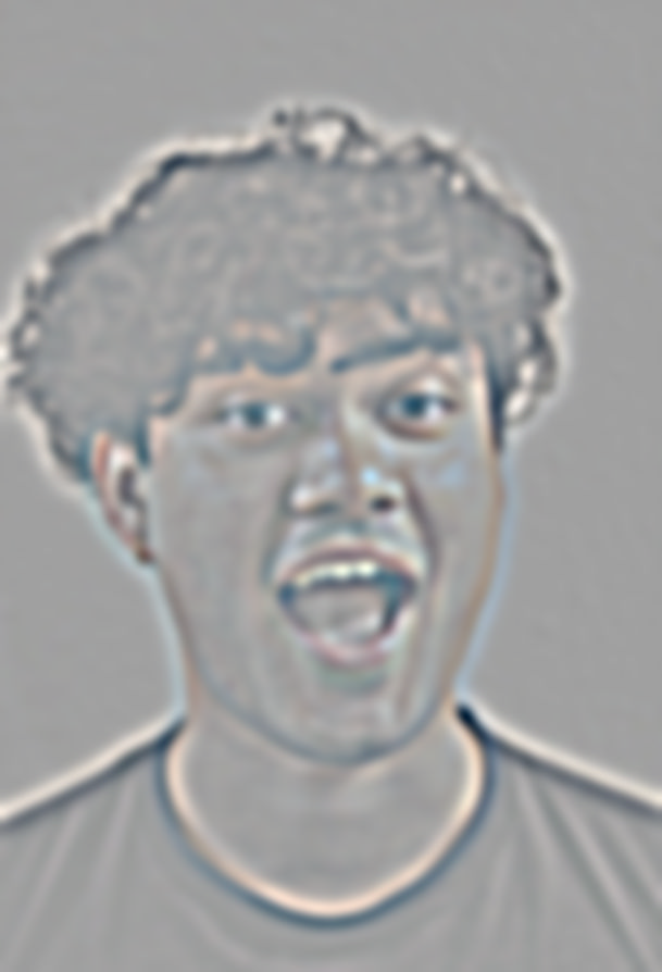
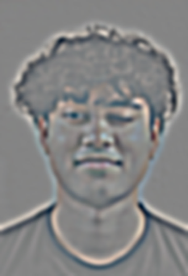
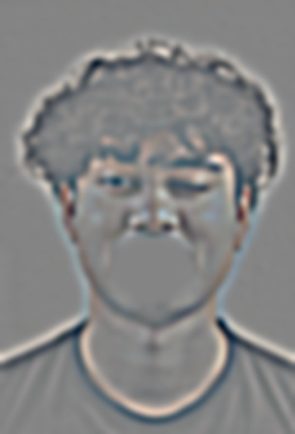
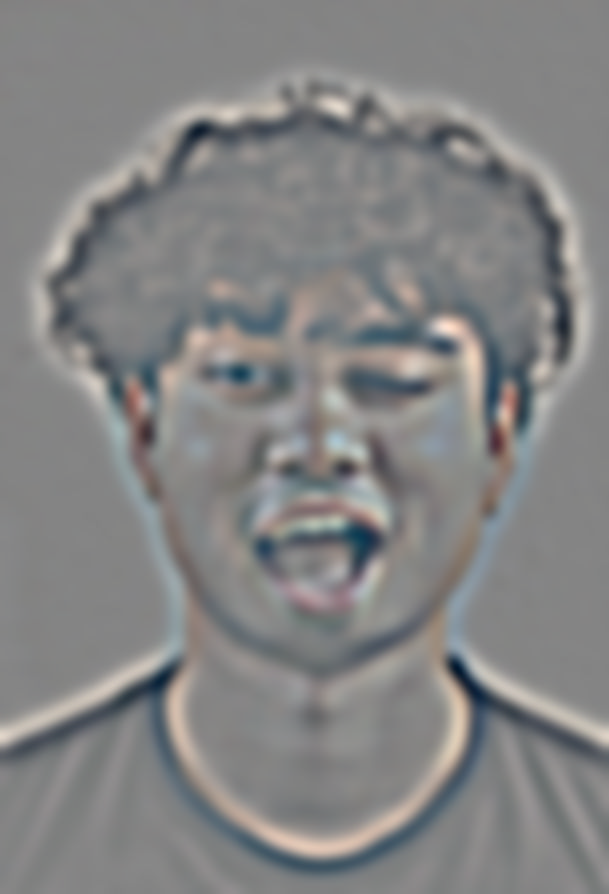







Wink and Joy Attempt 2 : Success
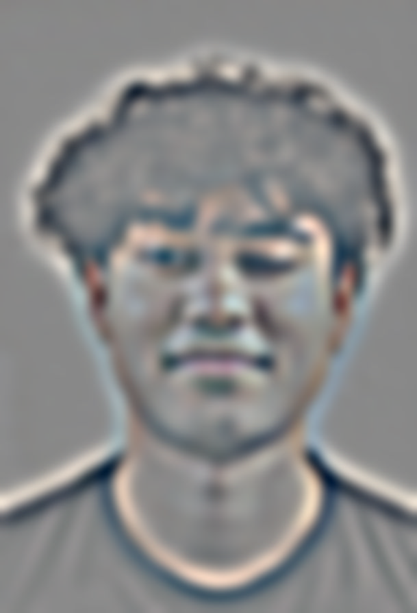
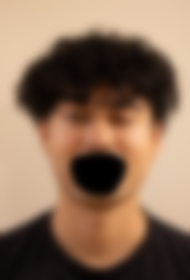
In this attempt, I chose to blend the eye component from the wink image atop the joy image. This was a success because the eyes are a more isolated part of the face and the blend is more seamless. The result is a convincing image that does not trigger the Uncanny Valley effect. This is a good example of how the choice of mask, as well as area blended, can affect the final image.
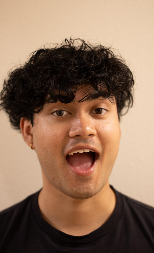
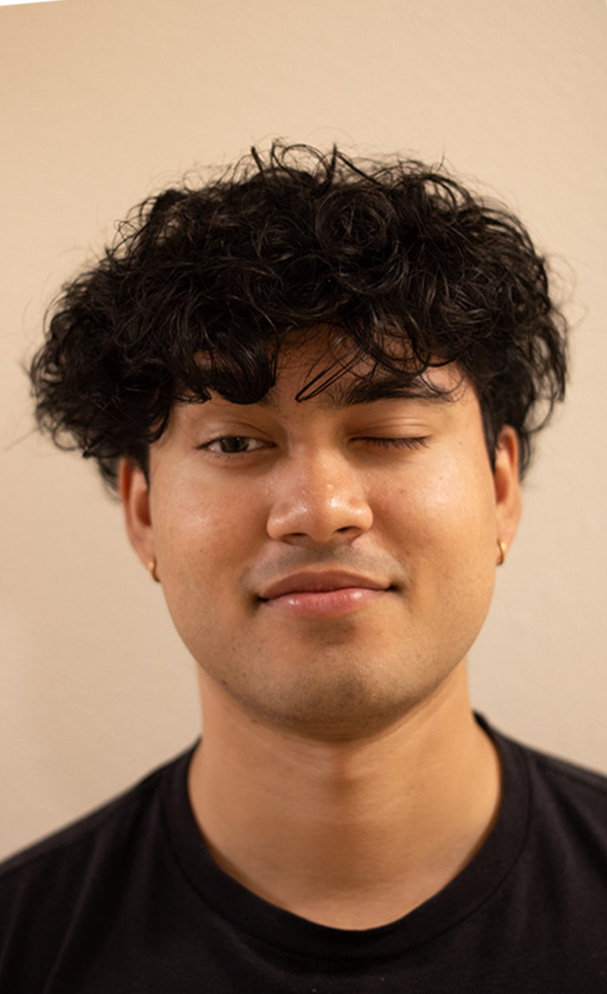

Image Stack


